

Why Your Contact Page Could Be Losing You Business
Learn how a well-designed contact page can encourage more enquiries and improve customer trust.
Why Your Contact Page Could Be Losing You Business
For many businesses, the contact page is the final step before a potential customer decides whether to get in touch.
If your contact page is confusing, difficult to use or missing important information, you could be losing enquiries without even realising it.
A well-designed contact page should remove uncertainty, build confidence and make it as easy as possible for someone to take that next step.
More Than Just a Contact Form
Many business owners treat their contact page as little more than a form with a submit button.
In reality, it is one of the most valuable pages on your entire website.
Visitors often arrive here after viewing your services, reading your reviews or browsing your portfolio.
By this stage, they are already interested.
Your job is simply to make contacting you straightforward.
Make It Easy to Get in Touch
People have different preferences when it comes to communication.
Some prefer filling in a contact form, while others would rather send an email or pick up the phone.
Providing multiple contact options allows visitors to choose what works best for them.
Depending on your business, you might include:
- A simple contact form
- Your email address
- A phone number
- Your business address, where appropriate
- Opening hours
- Links to your social media profiles
The easier you make it for someone to contact you, the less likely they are to leave and choose another business.
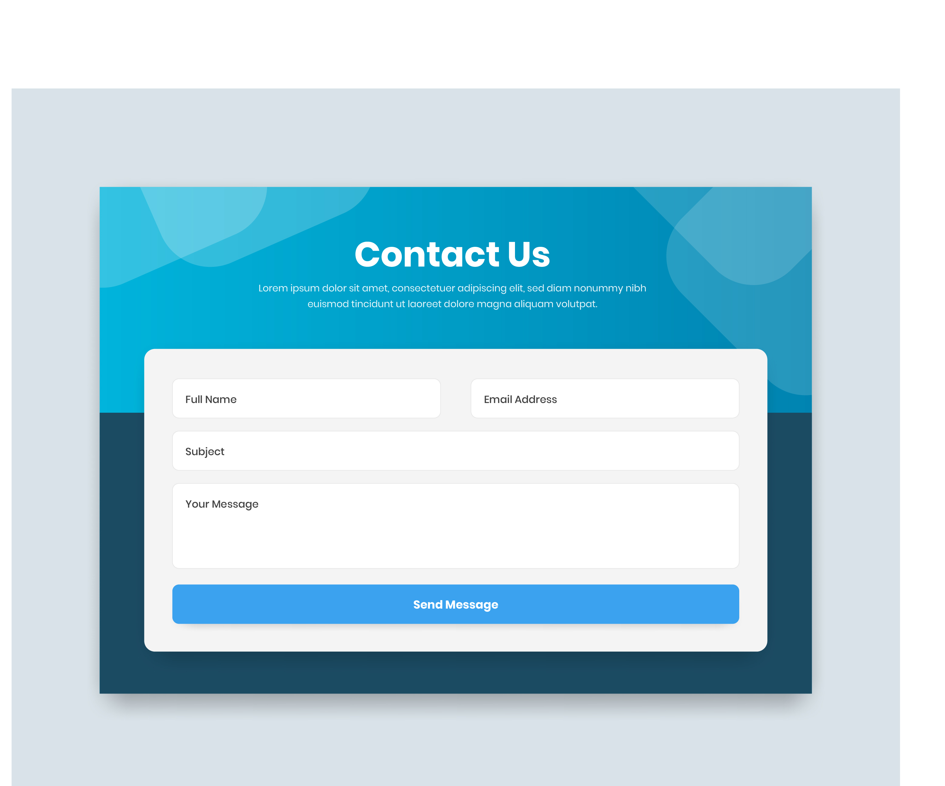
Keep Your Contact Form Simple
One of the biggest contact-page mistakes is asking visitors for too much information.
If someone only wants to ask a quick question, they do not want to complete twenty different fields before submitting their message.
Ask only for the information you genuinely need.
For many businesses, this could include:
- Name
- Email address
- Phone number
- Service required
- Message
You can always collect more detailed information after the initial enquiry.
A shorter and clearer form often feels less demanding and can encourage more people to complete it.
Use Clear Field Labels
Every contact form field should make it obvious what information is required.
Avoid vague labels or relying entirely on placeholder text that disappears as soon as someone begins typing.
Clear labels improve usability and make the form easier to complete, particularly for people using mobile devices or assistive technology.
It should also be obvious which fields are required and which are optional.
Build Confidence Through Transparency
Visitors want reassurance that they are contacting a genuine and reliable business.
Adding information such as your location, working hours, typical response times or a short introduction can help build trust.
For example, letting visitors know that you usually reply within 24 to 48 working hours immediately sets a clear expectation.
You could also explain whether consultations are held online, over the phone or in person.
These small details reduce uncertainty and help potential customers feel more comfortable making contact.
Do Not Forget Mobile Users
Many people will visit your contact page from a mobile phone.
Your form should be fully responsive, with fields and buttons that are easy to tap without zooming in.
Phone numbers should be clickable so visitors can call you directly.
Email addresses should also open a new message automatically when selected.
A contact form that works well on desktop but becomes awkward on mobile could be costing you a significant number of enquiries.
Reassure Visitors About Their Privacy
When someone submits a contact form, they are sharing personal information with your business.
Including a clear privacy notice and a link to your Privacy Policy helps explain how their details will be handled.
Your form should only request information that is relevant to the enquiry.
It should also include any consent wording required for how you intend to use or store that information.
A professional and transparent approach demonstrates that your business takes data protection seriously.
Make the Submit Button Clear
The button at the end of your form should clearly explain what will happen when someone selects it.
Generic wording such as “Submit” may work, but a more specific call-to-action can feel more engaging.
Examples include:
- Send My Enquiry
- Request a Quote
- Start Your Project
- Book a Consultation
- Contact D-S-Design Studio
The wording should match the purpose of the form and the action the visitor is taking.
Explain What Happens Next
After submitting an enquiry, visitors should not be left wondering whether their message has been received.
A confirmation message should appear immediately after the form has been submitted successfully.
Where appropriate, an automatic acknowledgement email can provide additional reassurance.
You can also use this message to explain when the visitor should expect a response and what the next stage of the process will involve.
This creates a more professional experience and reduces unnecessary follow-up messages.
Check That Your Form Actually Works
Contact forms should be tested regularly.
Website updates, email configuration changes, spam filters and third-party integrations can occasionally stop messages from reaching the correct inbox.
Complete a test enquiry and check that:
- The form submits successfully
- The confirmation message appears
- The enquiry arrives in the correct inbox
- Any automatic email is delivered
- The information is displayed clearly
- The form works on desktop and mobile
A contact form that appears to work but does not deliver enquiries can cause serious problems for a business.
Remove Unnecessary Barriers
Potential customers should not have to create an account, download an app or search through several pages before they can contact you.
Avoid hiding your contact details or making visitors complete an unnecessarily complicated process.
Every additional step creates another opportunity for someone to abandon the enquiry.
Your contact page should feel quick, clear and reassuring from beginning to end.
Review Your Contact Page Through a Customer’s Eyes
Take a fresh look at your contact page as though you were visiting the website for the first time.
Can you immediately find the information you need?
Is the form easy to understand?
Does the page explain when you will respond?
Does it feel trustworthy?
Can everything be completed comfortably on a mobile phone?
If the answer to any of these questions is no, your contact page may need some attention.
Turning Interest Into Enquiries
At D-S-Design Studio, every website is designed with a clear purpose.
Your contact page should provide a simple final step between someone becoming interested in your business and making a genuine enquiry.
Clear information, straightforward forms, strong calls-to-action and visible reassurance can all help improve the experience.
If your website is receiving visitors but not generating enough enquiries, a Website MOT can help identify problems with your contact page, user journey and overall conversion process.
.jpg)