Why Your Website Looks Fine but Still Isn’t Converting
A professional-looking website isn’t enough if it isn’t designed to convert visitors into enquiries.
A website can look professional and still fail to generate enquiries.
I see this all the time when reviewing small business websites. The design is clean. The colours work. Everything technically functions. Yet the enquiries just aren’t coming in.
That’s because looking professional isn’t the same as working effectively.
When someone lands on your website, they make decisions fast. If they feel unsure, confused, or unclear about what to do next, they leave. No matter how good the design looks.
Here’s why that happens.
Why “looking professional” isn’t enough
A website can be beautifully designed and still fail to convert if:
It doesn’t clearly explain what you offer
Visitors aren’t guided towards an action
Key information is hard to find
The messaging feels vague or generic
There’s no clear reason to get in touch now
Your website should remove friction, not create it. If users have to think too hard, they move on.
Common reasons websites don’t convert
These are the most common issues I see when reviewing small business websites.
1️⃣ No clear call to action
If your website doesn’t clearly tell visitors what to do next, they won’t take the next step.
Whether that’s enquiring, booking a call, requesting a quote, or making a purchase, the action needs to be obvious and repeated naturally throughout the site.
If users have to search for how to contact you, that’s already a lost opportunity.
2️⃣ Trying to say too much at once
More information doesn’t mean more clarity.
Overloading pages with long blocks of text, multiple services, or mixed messages makes it harder for visitors to understand what you actually do.
Clear websites focus on one message at a time and guide users through it step by step.
3️⃣ Poor structure and flow
A good website leads users naturally from interest to action.
If pages jump around, headings don’t make sense, or there’s no clear hierarchy, visitors disengage quickly.
Structure matters just as much as visuals. Without it, even strong content gets ignored.
4️⃣ Weak trust signals
Trust is fragile online.
Missing testimonials, outdated content, unclear branding, inconsistent visuals, or a poor mobile experience all raise doubt.
If visitors aren’t confident in your business within seconds, they won’t enquire.
5️⃣ Not designed with SEO and users in mind
If your website isn’t structured properly, it struggles in search results and frustrates real users.
SEO and user experience go hand in hand. A site that’s hard to read, slow to load, or badly structured performs poorly for both Google and people.
What a converting website actually needs
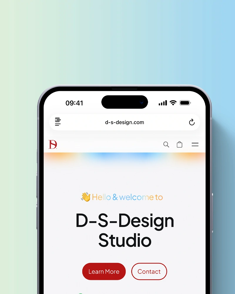
At D-S-Design Studio, every website is designed with conversion in mind from the very beginning.
That means:
Clear messaging that explains your services quickly
Thoughtful page structure that supports SEO and usability
Strong calls to action placed where users expect them
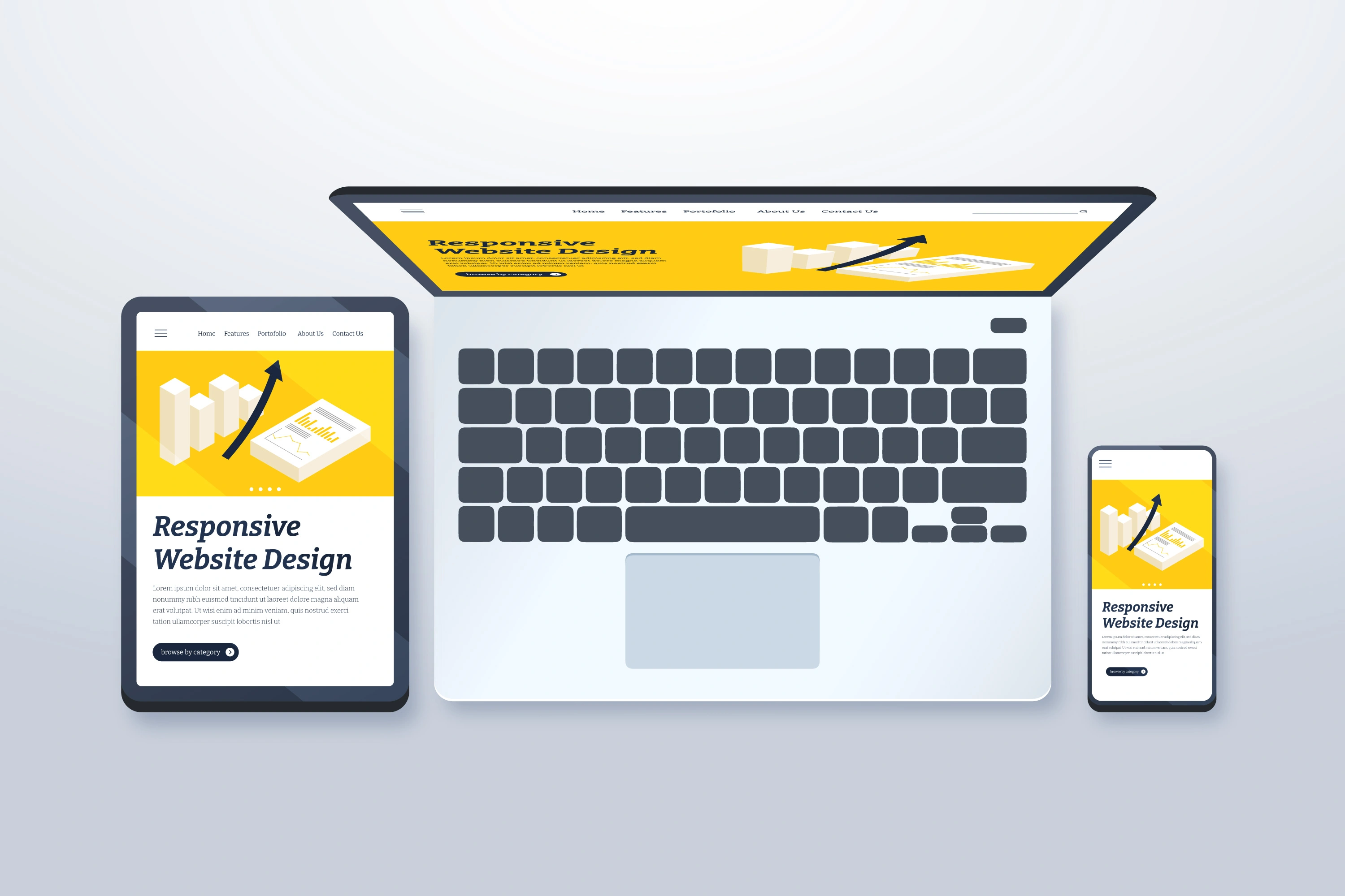
Mobile-friendly layouts that work across all devices
Design choices that support trust, clarity, and confidence
If you’re planning a new site or a redesign, you can explore how I approach this here:
Is your website helping or holding you back?
If your website isn’t generating enquiries, it may not need a full rebuild.
Often, a strategic review highlights exactly what’s blocking conversions and how to fix it without unnecessary complexity.
A focused review through a
can uncover layout, messaging, SEO, and usability issues that quietly cost you leads.
For long-term performance, updates, and peace of mind, ongoing support through
keeps your site working properly after launch.
Ready to improve your website’s performance?
If you feel like your website should be doing more for your business, now is the right time to address it.
Free, no-obligation quotes are available.
👉 Get in touch with D-S-Design Studio
I’m always happy to review a website, talk through ideas, or explain what changes would make the biggest difference. No pressure, just honest advice.